We Belong Outside
Sarah Pisarczyk’s Senior Thesis (BFA 2023)
the outdoor industry’s role in designing and weaponizing dysfunctional women’s gear
Overview
-
We Belong Outside is an exhibition design project that critiques the outdoor industry’s role in designing and weaponizing dysfunctional women’s gear. It explores the ways that the outdoor industry creates a false, binary representation of women, perpetuates sexist narratives, and hinders participation in the outdoors. This erases the truth and distorts the history of women in the outdoors. We Belong Outside incorporates product design via compiled research, artifacts, data, and visual analysis to investigate how problematic design and narratives have been perpetuated by the outdoor industry across time.
Product design and the industry’s depiction of women have a powerful impact on the experiences that women have in the outdoors. Women are traditionally depicted in the outdoors as maternal figures, childlike, sex objects, or supportive partners. The reality is that women experience the outdoors in every sweaty, challenging capacity imaginable, just like men.
Women’s participation in the outdoors depends on actively including them through high-quality, functional gear. We Belong Outside reclaims the outdoors for women, and by extension, for all.
-
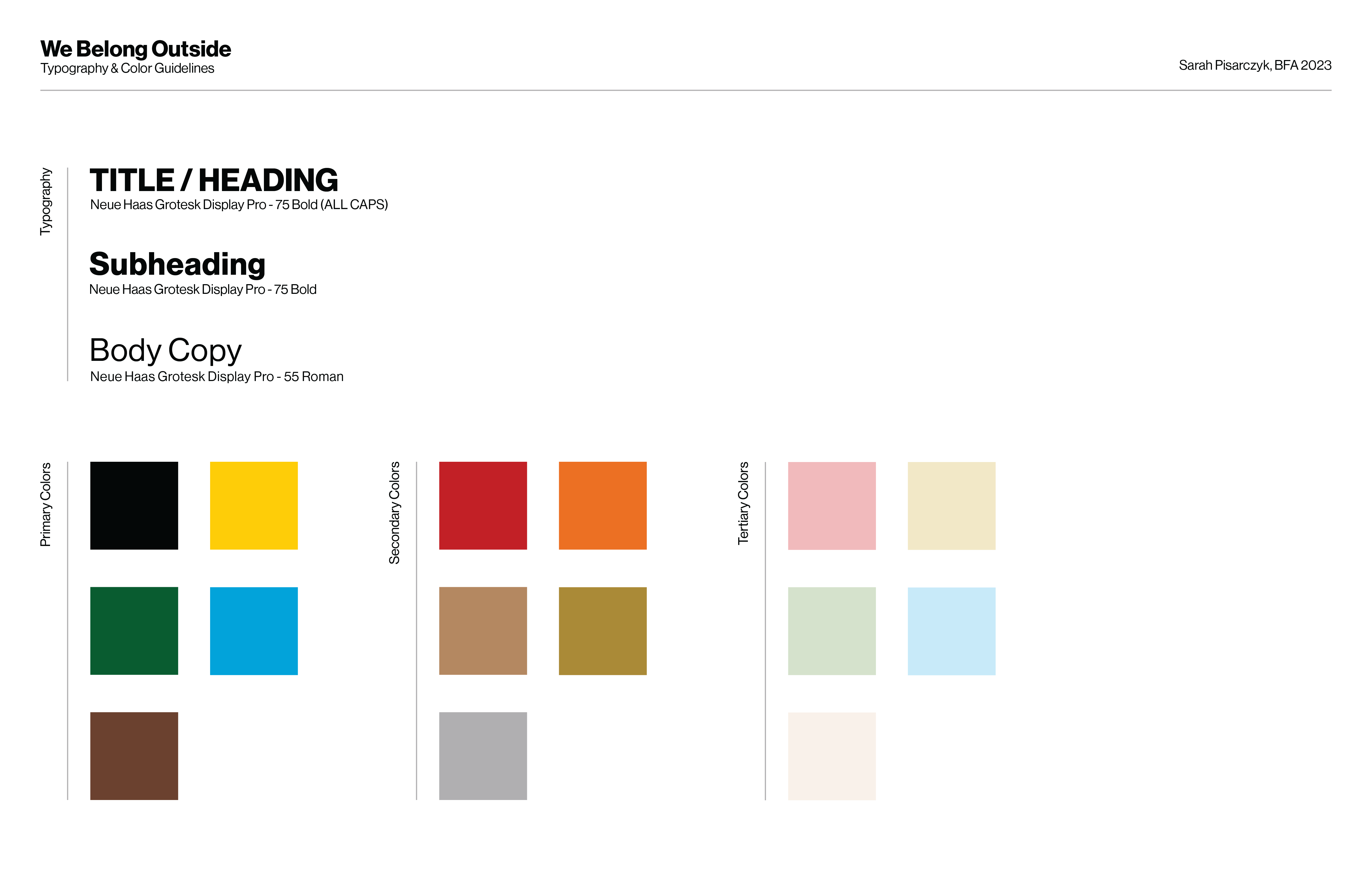
Attention to detail is evident in every aspect of this project, including its exhibition design. Drawing inspiration from trail maps and sources of way finding, the color palette and typography chosen for the exhibition create a sense of continuity that is both visually engaging and highly legible. By going beyond sexism and embracing the aesthetics of the outdoor industry, the design guidelines speak to the project's commitment to inclusivity and empowerment for all.
Exhibition Design Guidelines Photo -
My journey started with a visual analysis of the depiction of women in the outdoors. I used collage work to make visual discoveries from books, National Geographic magazines, artifacts of gear, and outdoor experiences. From this exploration, I realized that the representation of women in the outdoor industry is often sexist and fails to reflect the reality of women's experiences. I knew I had to break out of the tired clichés that perpetuate sexism in the industry and make something new, different, and true to women's experiences.
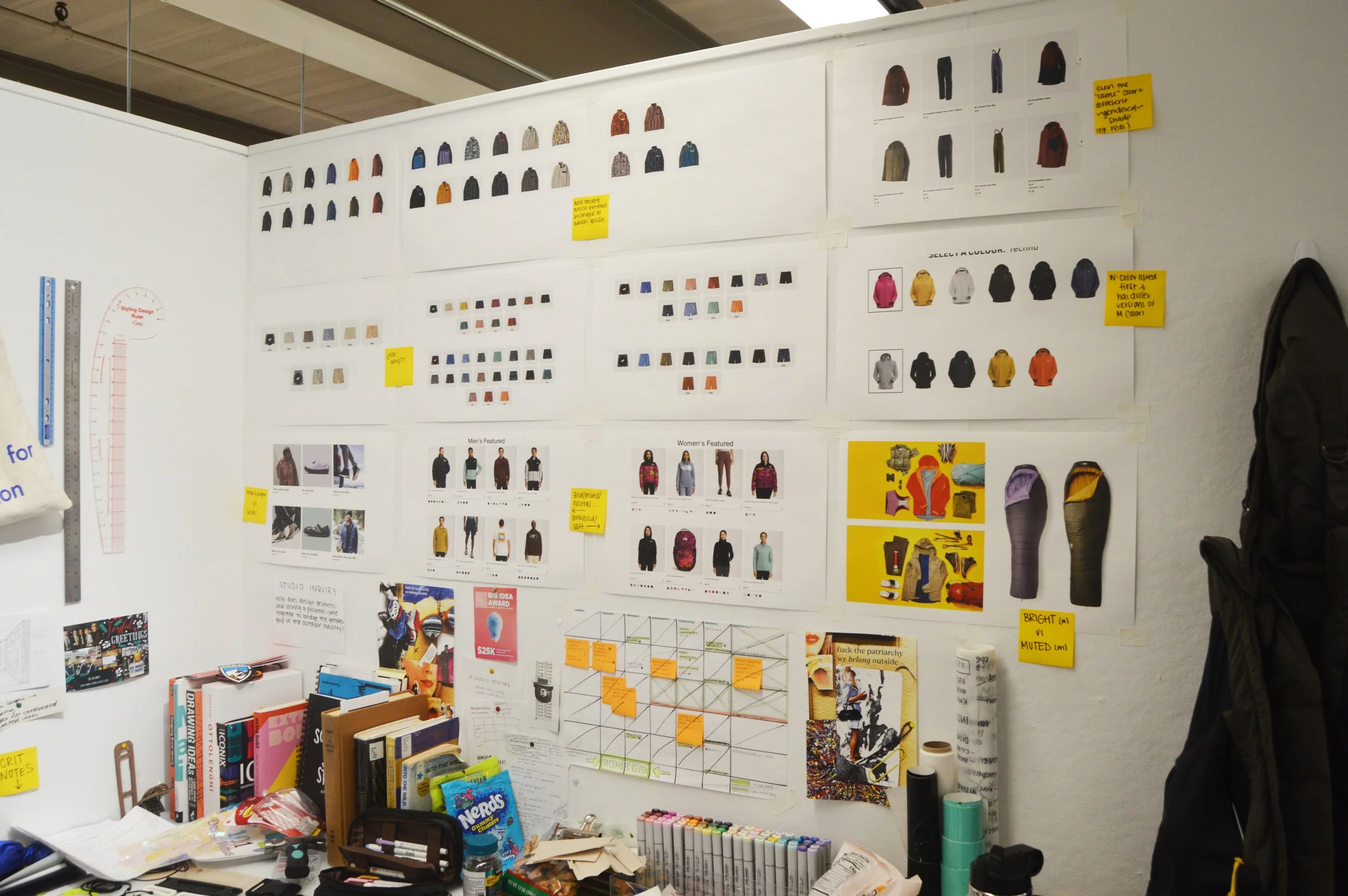
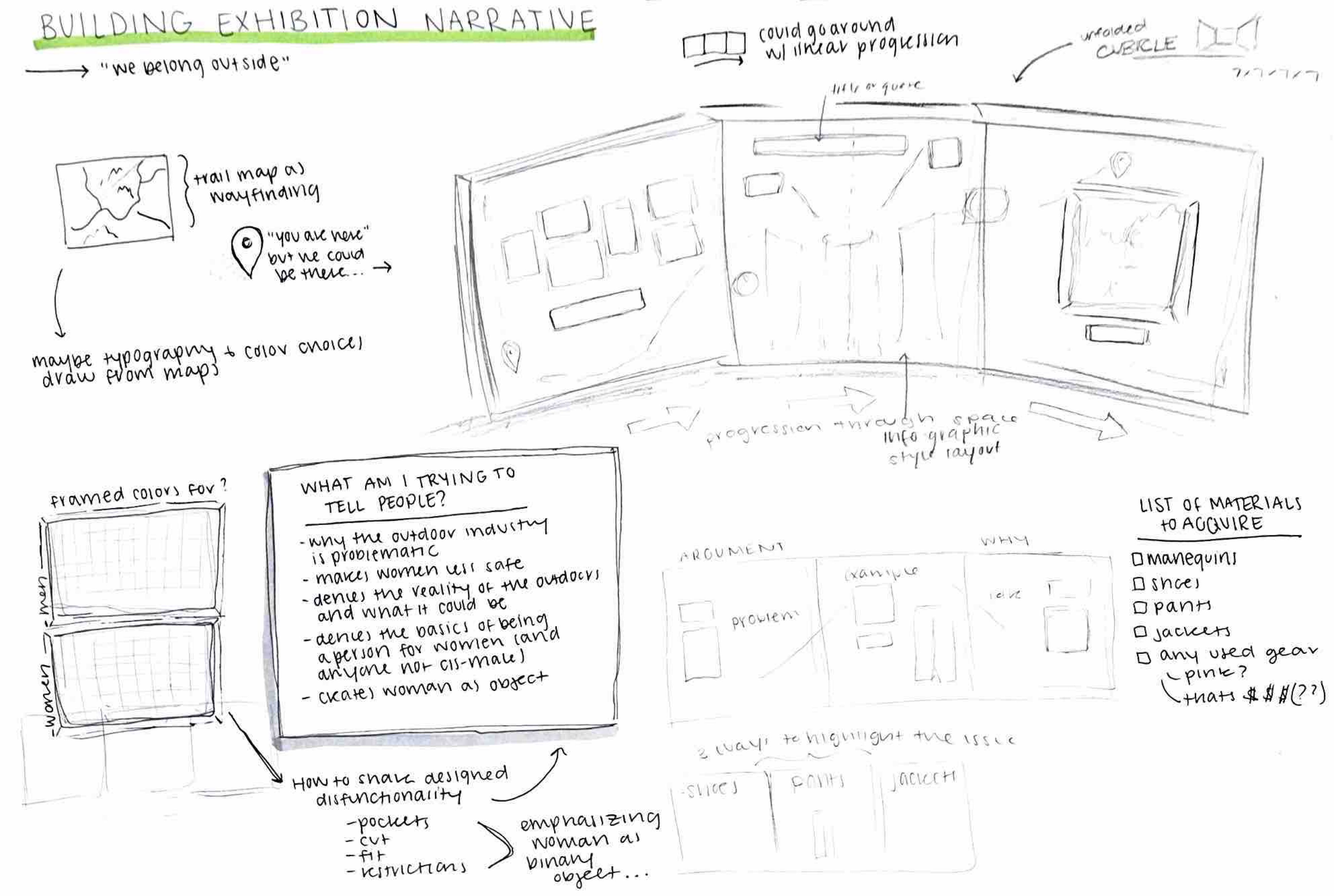
To visualize my ideas, I spent a lot of time sketching and thinking about the exhibition space. I wanted to create an indoor space that would convey the messiness and authenticity of the outdoors. Throughout this process, I also discovered the importance of compiling things to discover new ideas.
For the exhibition itself, I started by sketching in 2D, moved into 3D sketch models, back to 2D technical planning, and then shifted to mocking up the physical space I would be working in.
As a result of my creative process, my final IP project challenged the status quo of the outdoor industry by critiquing its sexist and limiting representations of women. Through my exhibition, I aimed to create a space that celebrates women's experiences in the outdoors and supports them with high-quality gear.
Exhibition
Wall Treatment
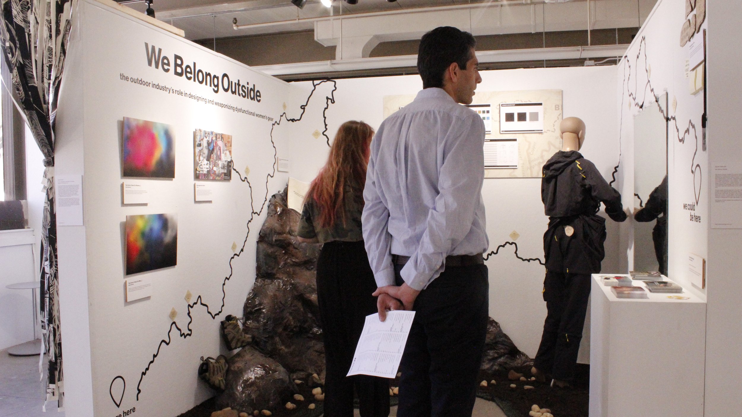
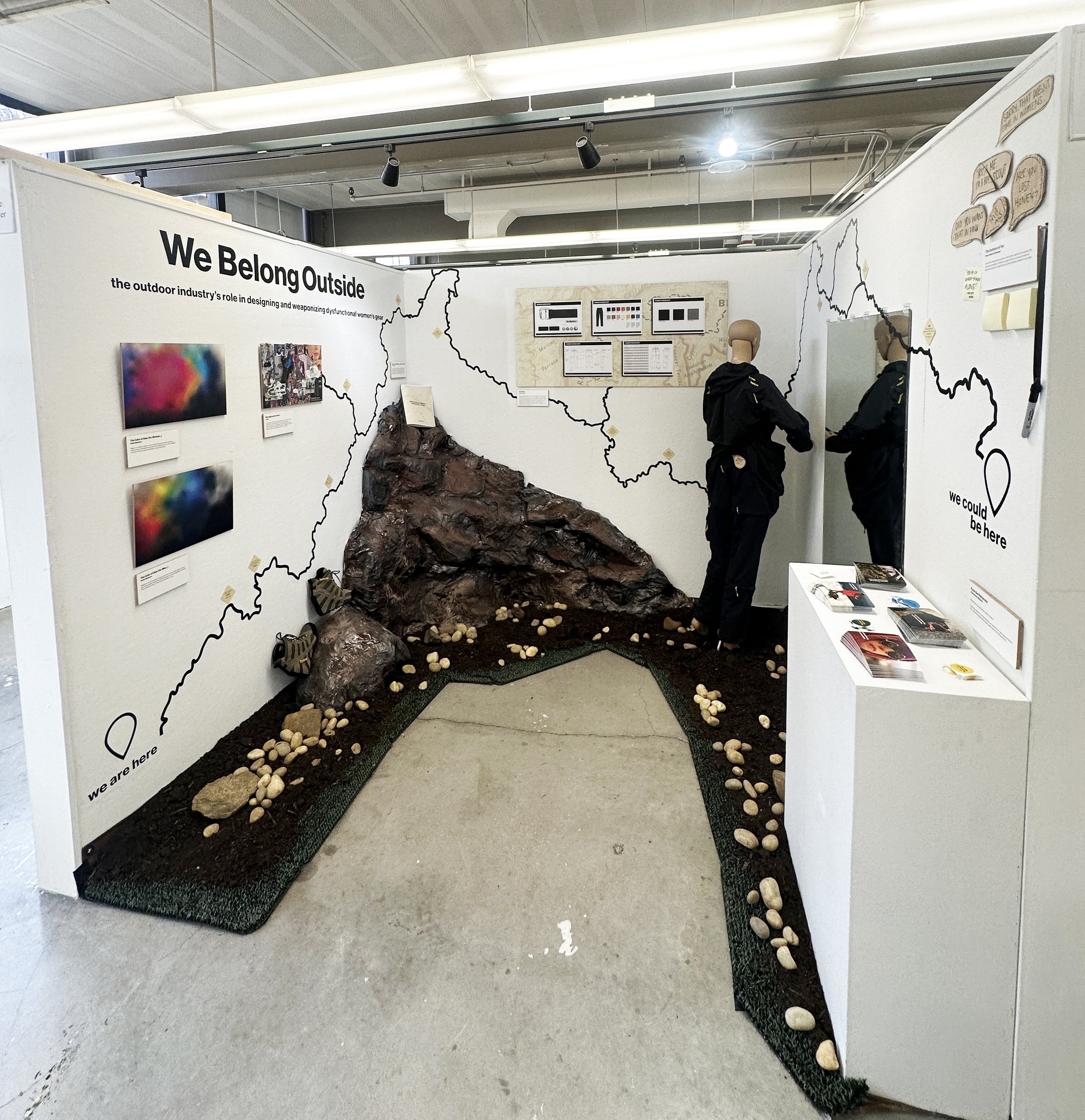
In the exhibition, the wall treatments play a crucial role in guiding visitors through the space. The trail map, which draws inspiration from the Pacific Crest Trail that holds personal significance, was designed on Adobe Illustrator and cut on a large-format vinyl cutter with permanent vinyl. The result is a visual representation of a journey that creates a seamless transition between the 2D works on display.
Additionally, the trail markers serve as a reference to important data about women's experiences in the outdoors while also working within the visual language of the trail map's way-finding system. These elements come together to enhance the overall experience of the exhibition and guide visitors through the space.

The Color of Gear (for Women…)

The Color of Gear (for Men…)
The Color of Gear
This body of work is a critical analysis of the outdoor industry's gendered color distribution in gear for women and men. I conducted a visual analysis of the most popular outdoor gear for each gender and created gradient prints to represent the color distribution in each category. Through this project, the industry's gendered marketing tactics and how it perpetuates harmful gender stereotypes are highlighted.
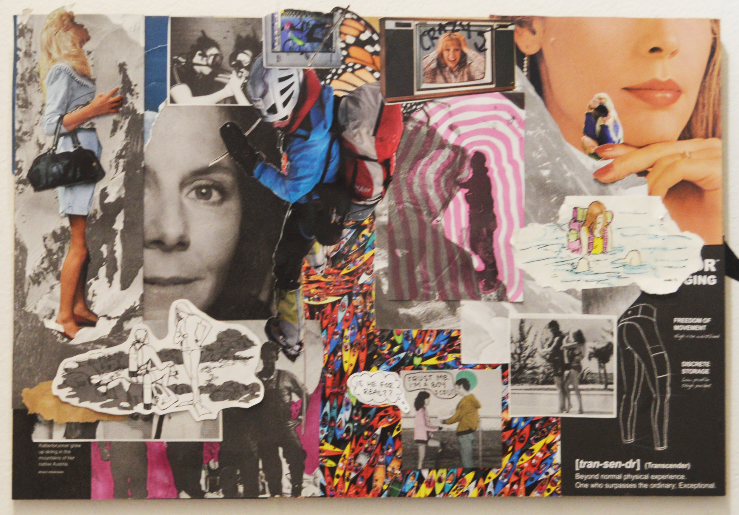
Microaggressions Galore
Through the process of creating this collage, I was able to make visual discoveries about the outdoor industry and the issues that women face in the outdoors. Composed of National Geographic magazines, instructional books, nature photography, and advertisements from the outdoor industry, this collage served as the foundation for the direction of this exhibition. By exploring the issues of safety, erasure, and truth, this artwork serves as a powerful nod to the work that inspired me to create We Belong Outside.
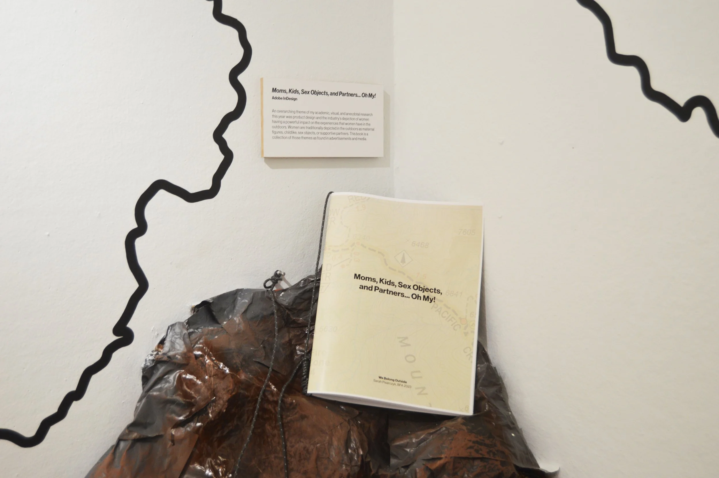
Moms, Kids, Sex Objects, and Partners... Oh My!
An overarching theme of my academic, visual, and anecdotal research this year was product design and the industry’s depiction of women having a powerful impact on the experiences that women have in the outdoors. Women are traditionally depicted in the outdoors as maternal figures, childlike, sex objects, or supportive partners. Using Adobe Illustrator and Adobe InDesign, I created this book as a collection of those themes as found in advertisements and media. The book serves to showcase the ways in which the outdoor industry perpetuates sexist narratives and hinders women's participation in the outdoors.
For a full flip through of this work, watch the video below.
Tech Pack
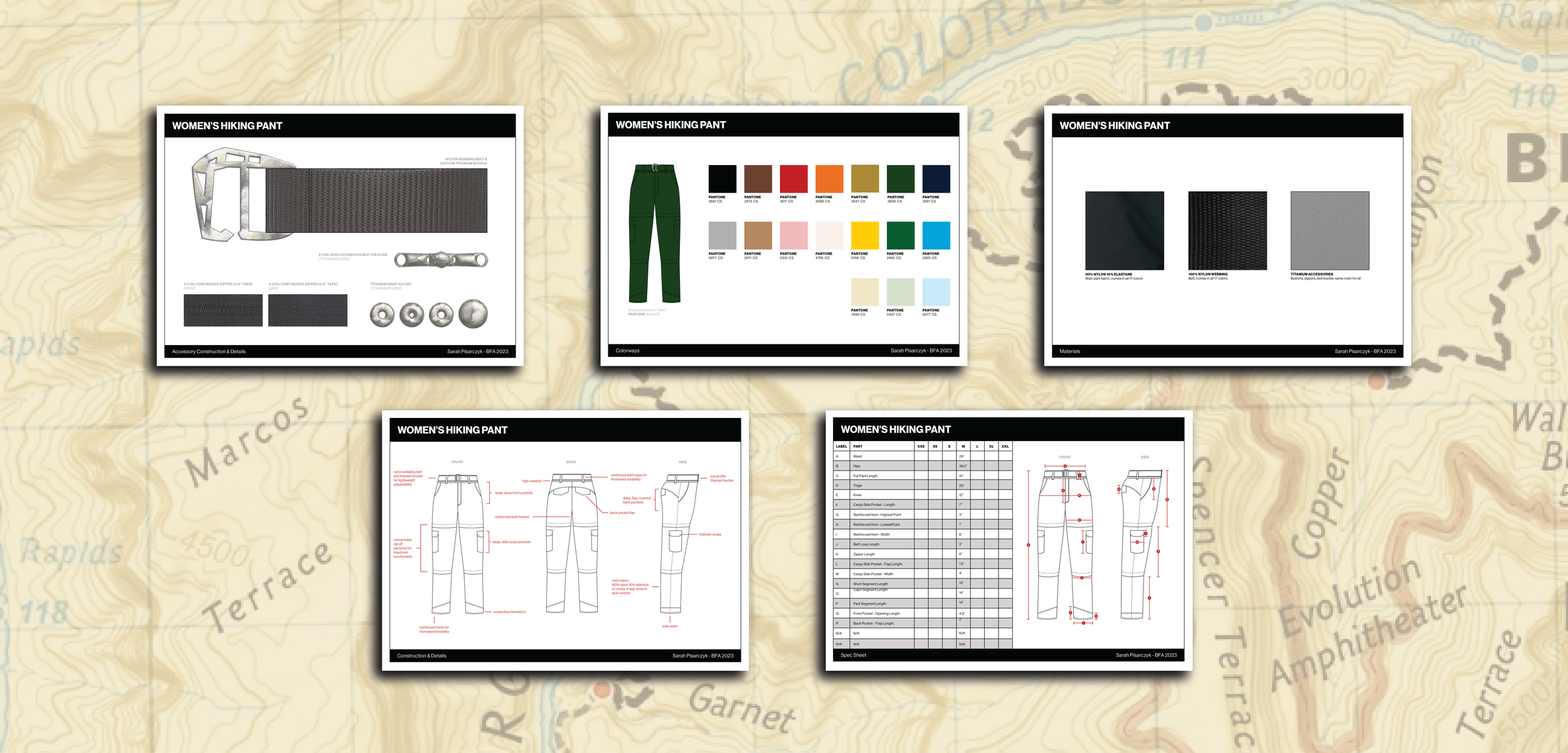
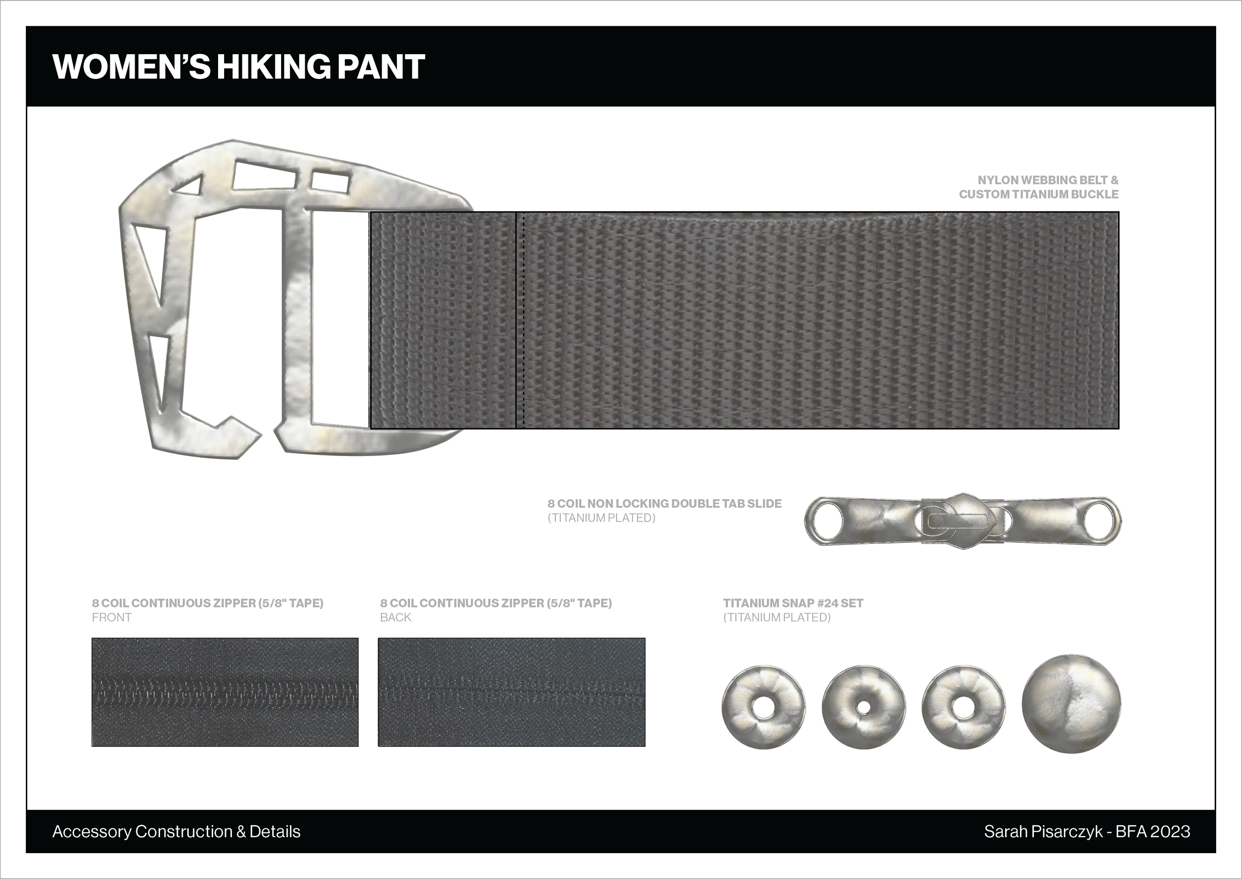
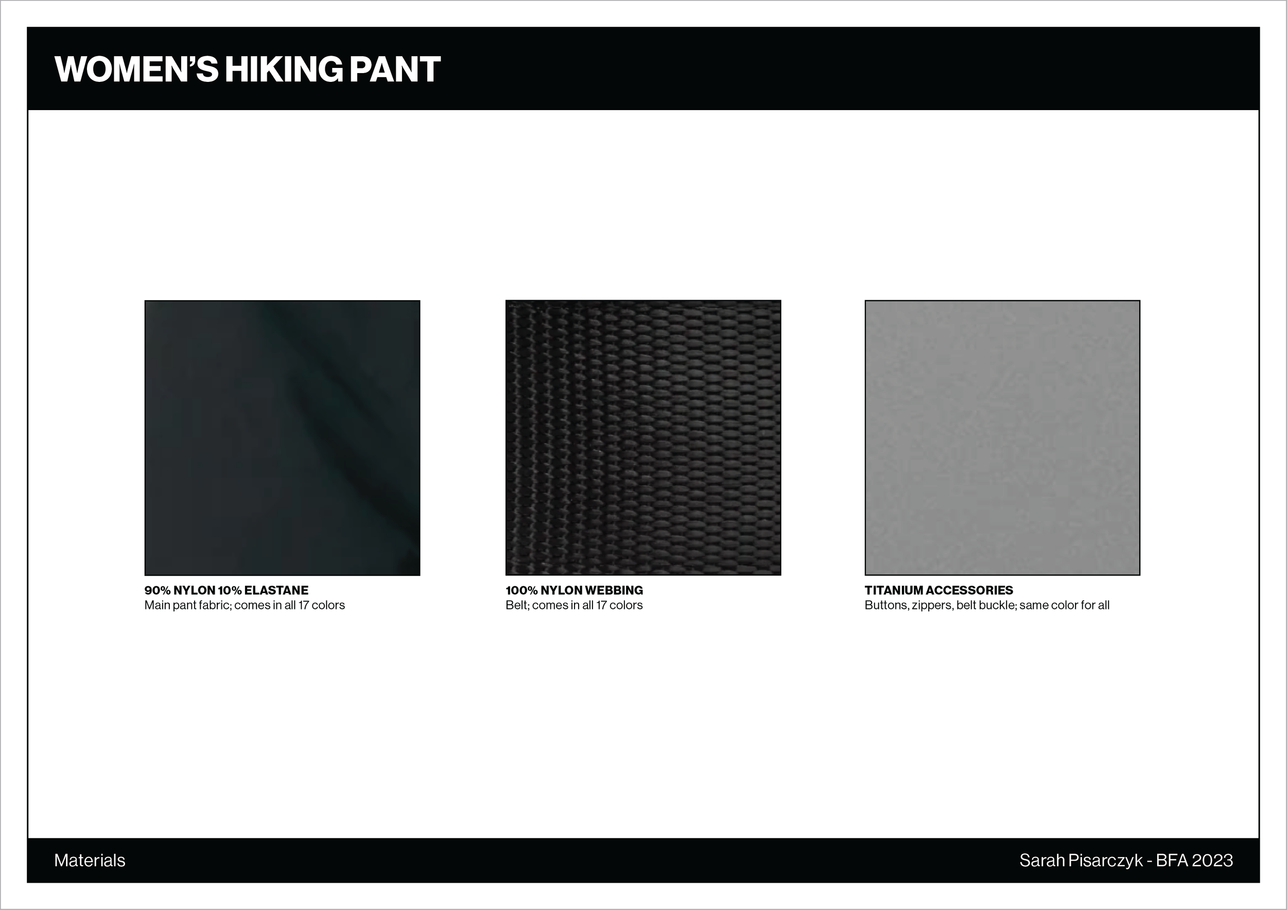
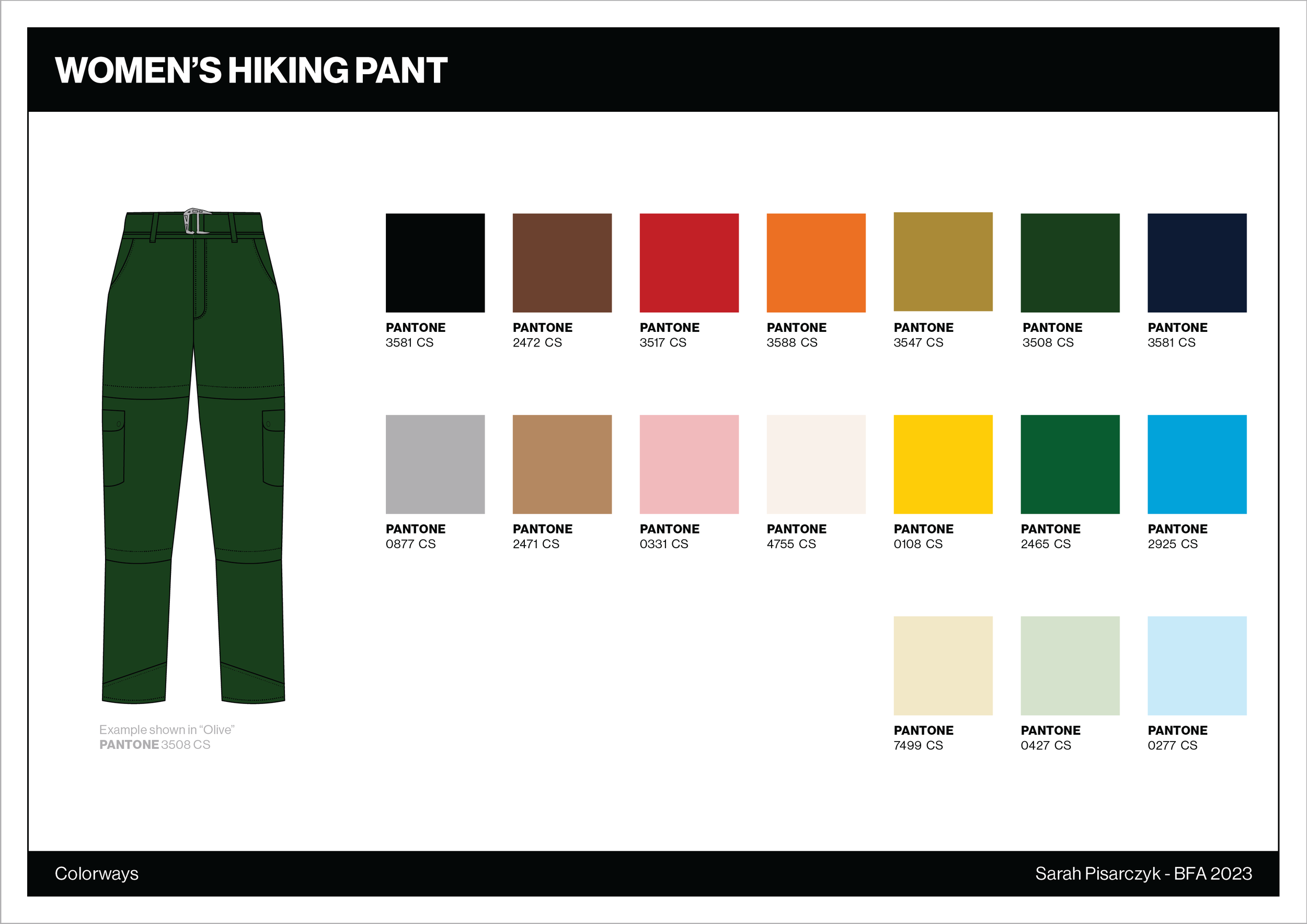
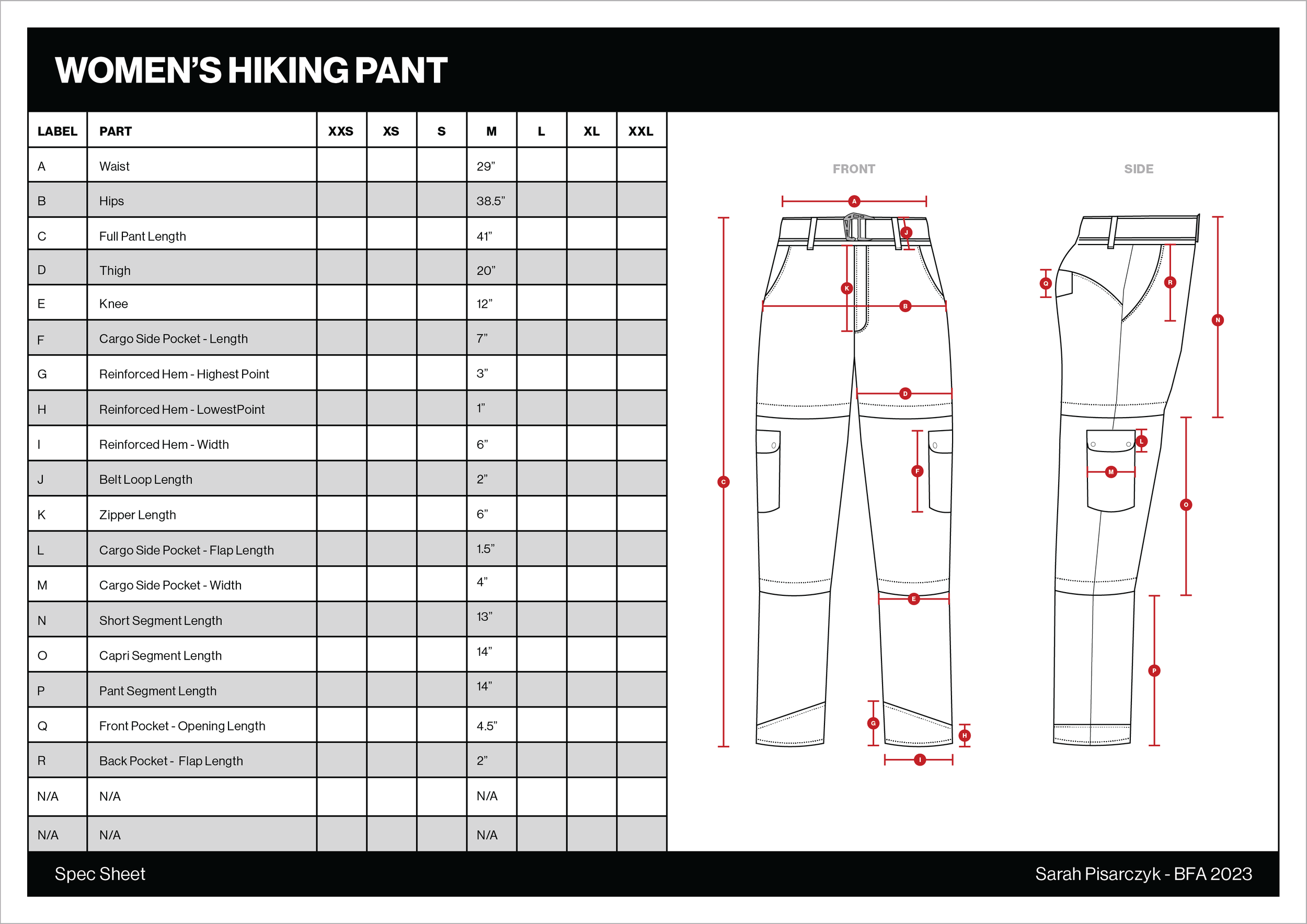
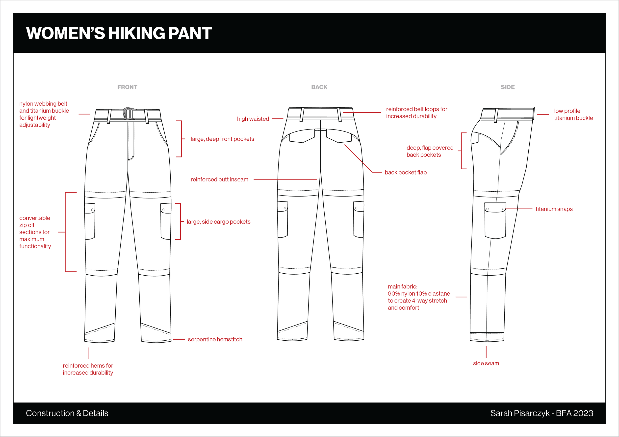
As a designer, I aspire to create high-quality and functional gear for women in the outdoors. One of the most frustrating issues facing women is the inadequate design of hiking pants. To address this problem, I designed my own hiking pants with input from outdoor enthusiast, model, and activist Q Berkompas (she/they). The criteria for these pants were established through extensive research and collaboration, resulting in a tech pack that adheres to industry standards in garment and gear development. The pants feature 4-way stretch, a high waist, deep pockets, a built-in belt, high-quality material, and reinforcements for durability. Through this process, I am excited to explore the intersection of design, activism, and the outdoors.
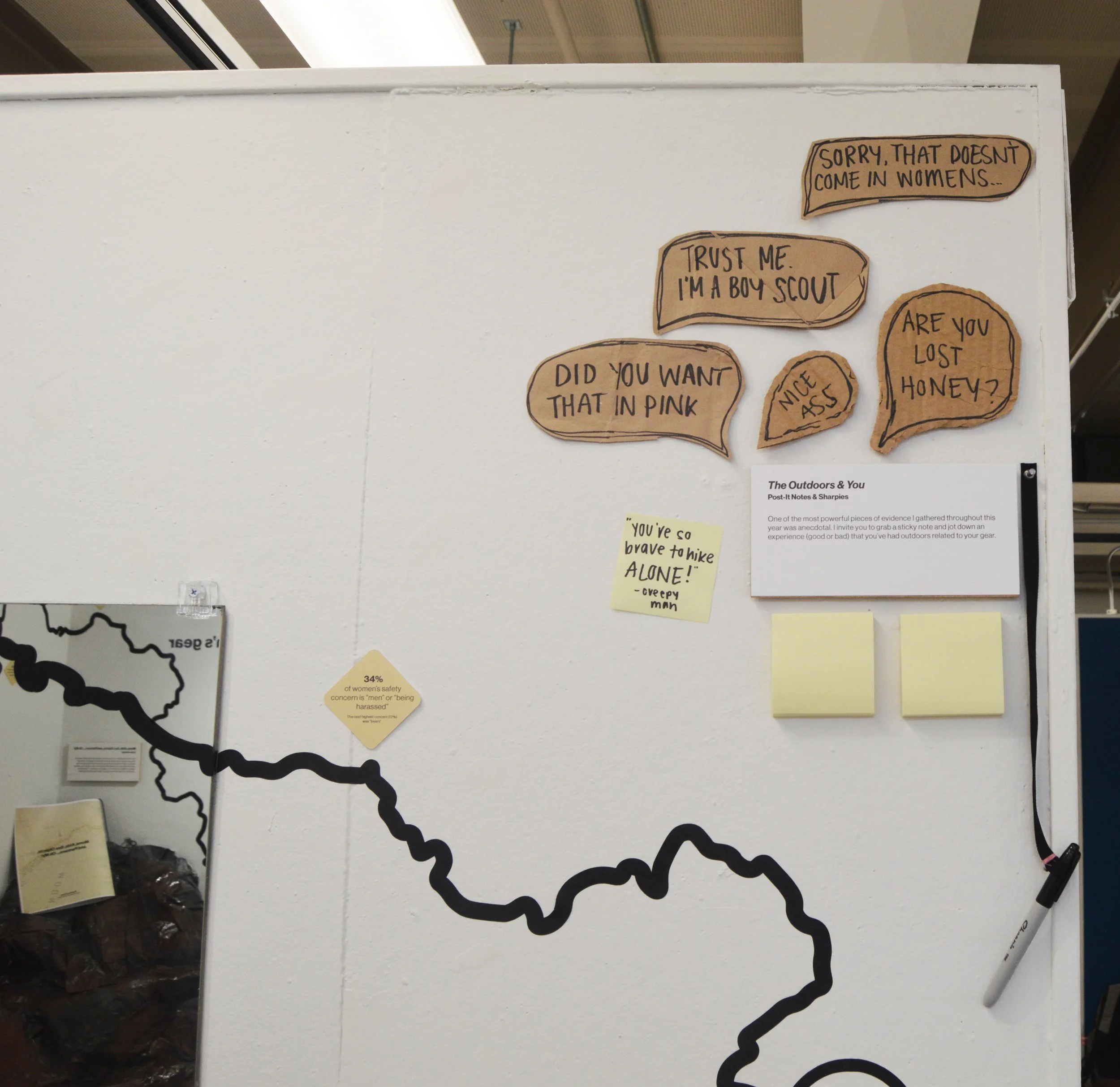
The Outdoors & You
Anecdotes are powerful tools that help us understand the personal experiences of individuals. In my research for this exhibition, I found that anecdotal evidence was one of the most powerful pieces of evidence that I gathered. That's why I've created an interactive space where visitors can share their own experiences related to their gear while in the outdoors. Using sticky notes and sharpies, I invite viewers to jot down your experience - good or bad - and stick it on the board. By sharing our experiences, we can work towards creating a more inclusive and diverse outdoor community.
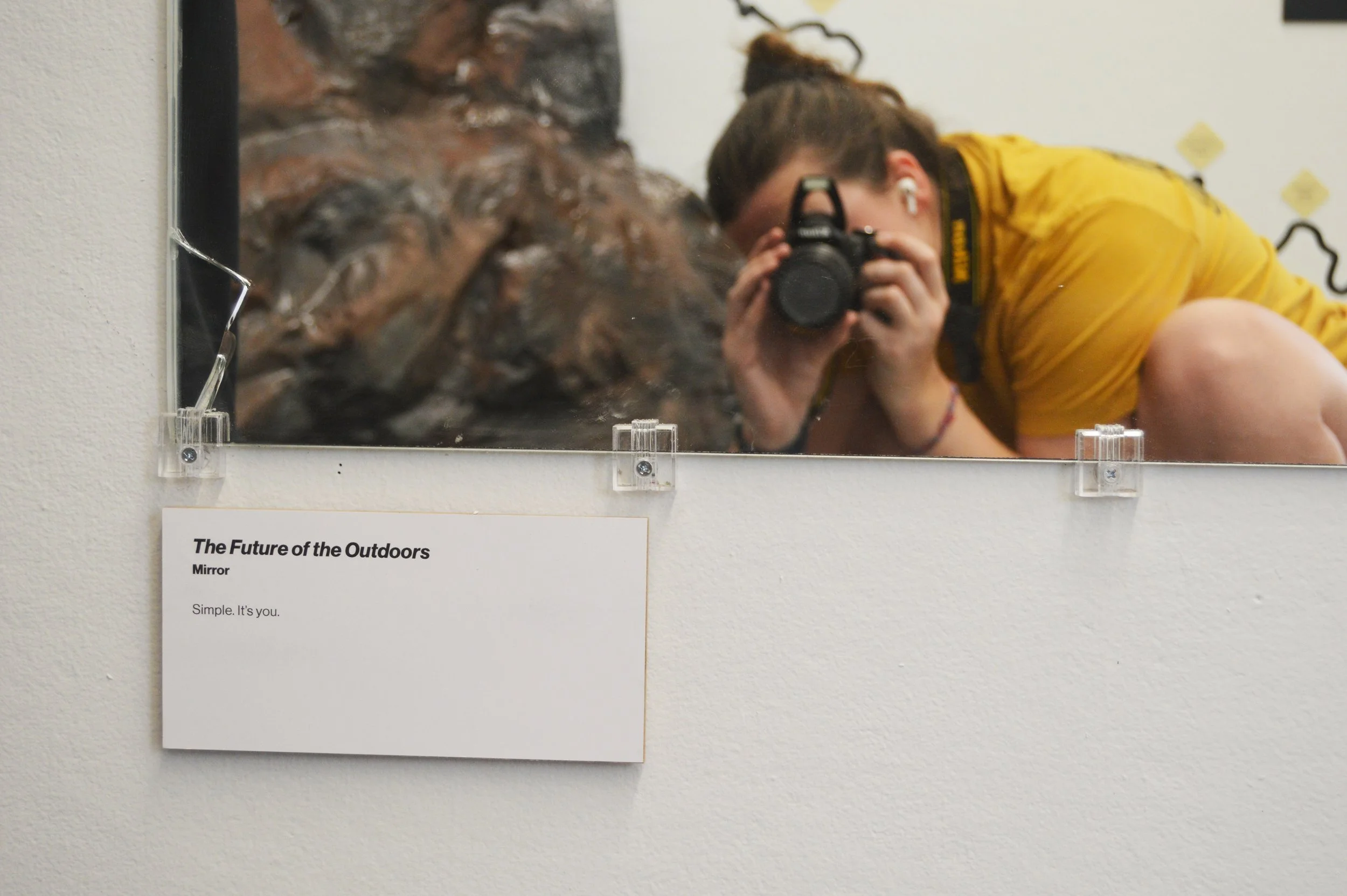
The Future of the Outdoors
The large mirror in this exhibition bears a powerful message about the future of the outdoors: it's you. This statement symbolizes the inclusive nature of outdoor spaces and the importance of diverse representation in the outdoor industry. By creating more accurate and varied depictions of women and other groups in the outdoors, we can build a more welcoming and inclusive outdoor community. The mirror serves as a call to action for visitors to see themselves as integral parts of the outdoor world and to strive for a more equitable and representative future.


From top to bottom, left to right there are the 4 front designs of all the postcards and then the back (which applies to all of them). Stickers (to the right) are printed in circles.
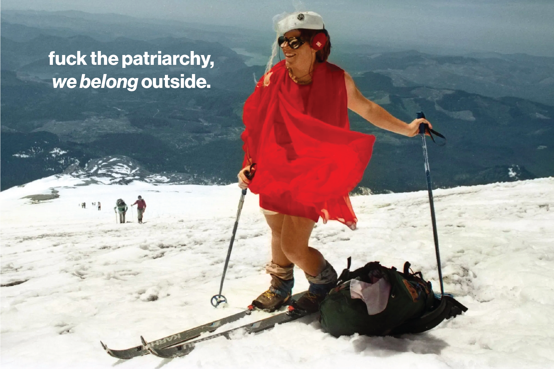
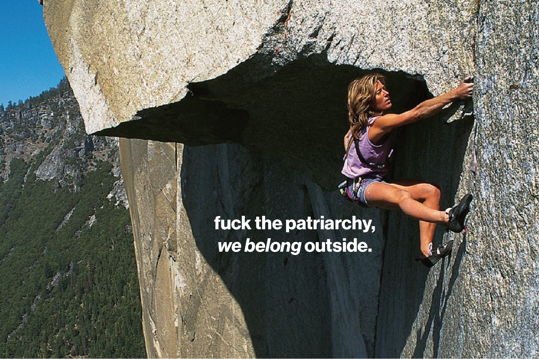
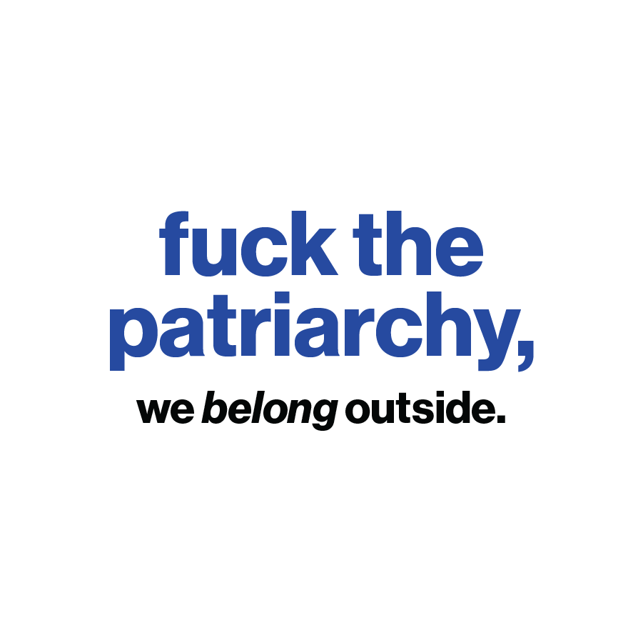


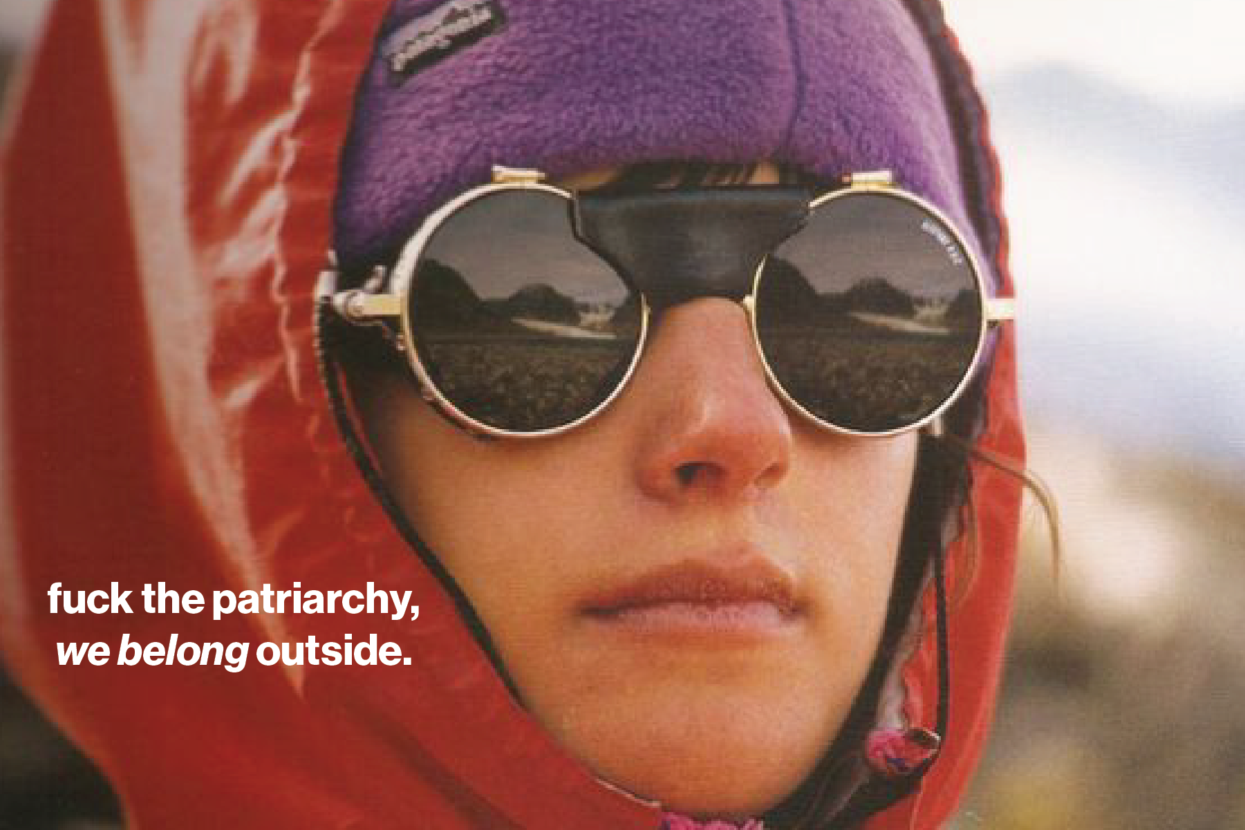
Fuck the Patriarchy
The outdoors is for everyone, and you deserve to have the gear that supports your experiences. For viewers, I hope these items serve as a reminder that we are all capable of enjoying the outdoors, and that the patriarchy has no place in dictating what that looks like. It is also a small thank you for visiting We Belong Outside.

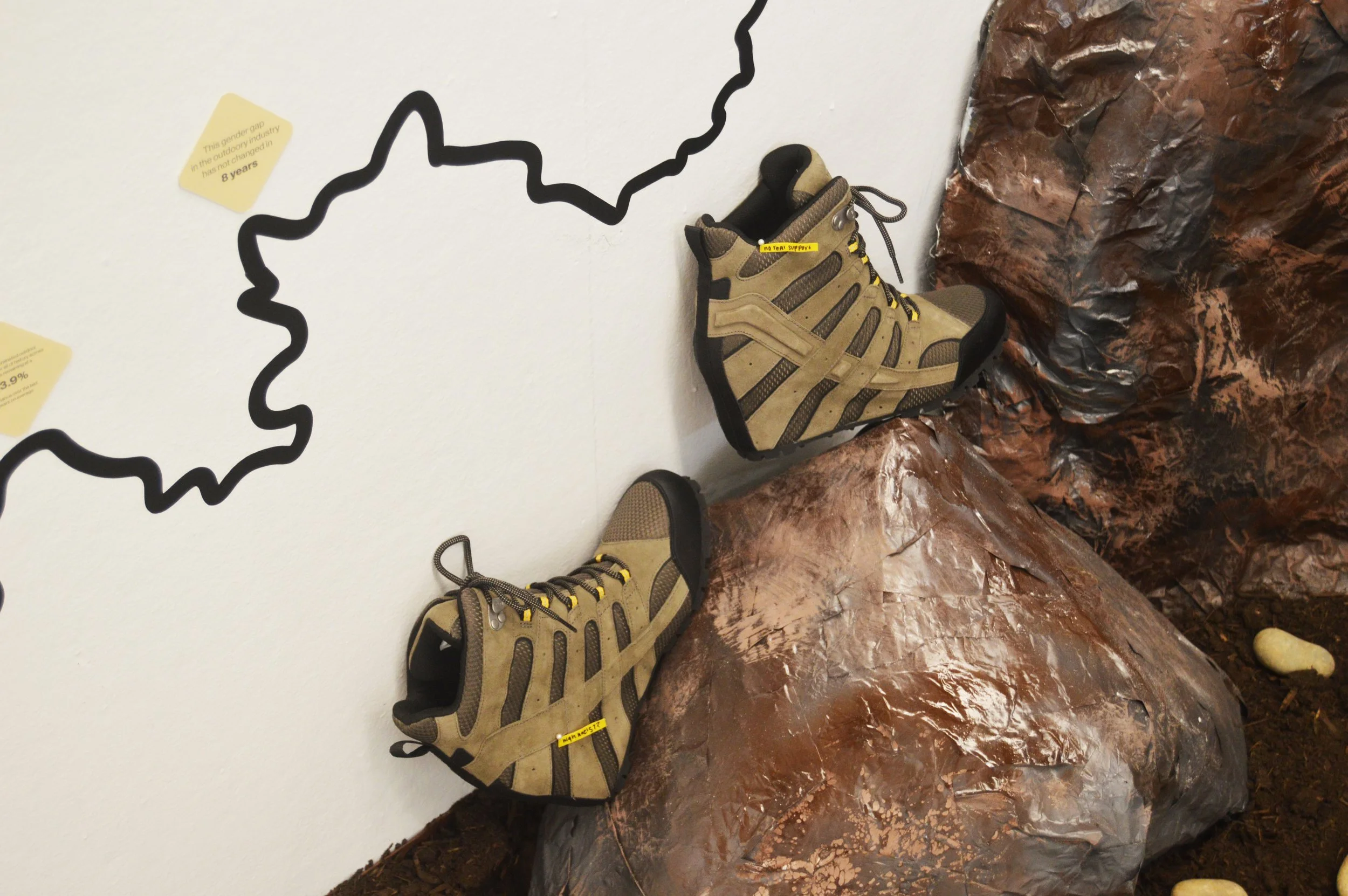
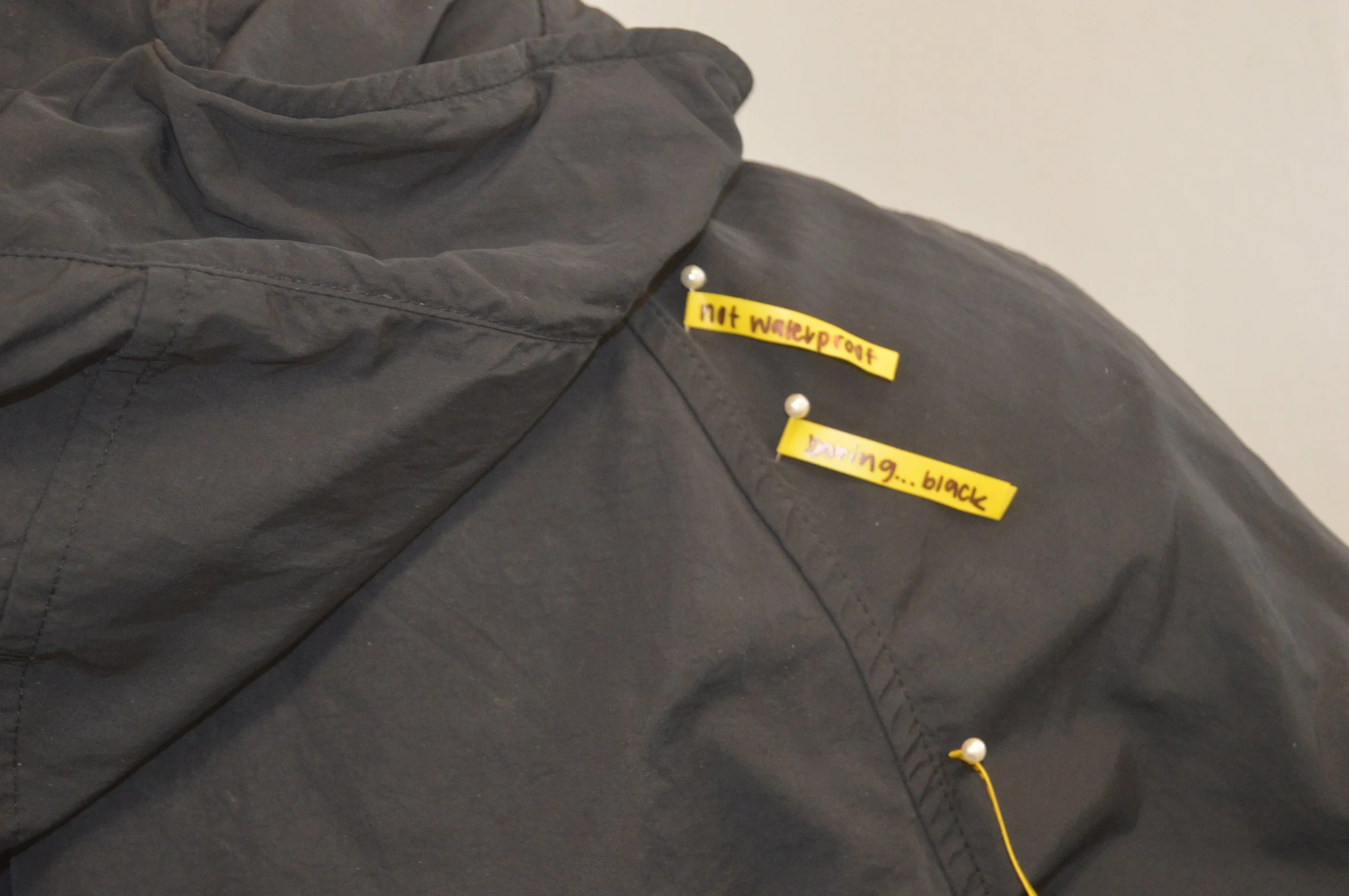
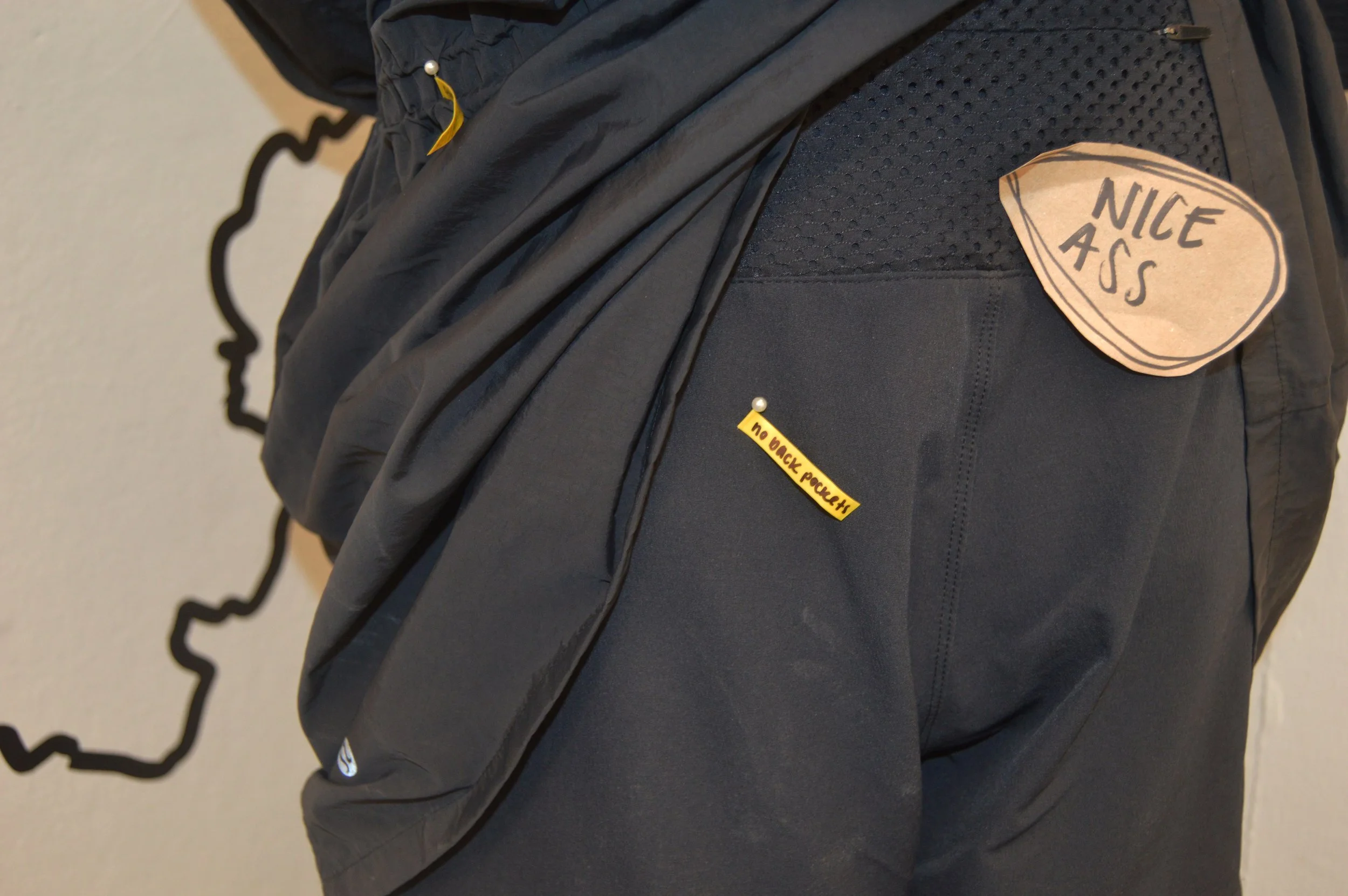
Gear as Example
Breaking barriers and exposing industry gaps, this project's use of gear serves as a powerful visual commentary on the overlooked needs of women in the outdoors. From the absurdity of high heeled hiking boots to the notes pinned on poorly made pieces, every detail highlights the importance of data and analysis in creating gear that truly empowers all adventurers.
Design Precedence
-
Warren Cherry's industrial design process for the Mountain Hardware Avalanche System, showcased on Behance, serves as an artistic precedent for my final project's tech pack. His process is detailed and thorough, showcasing both analog and digital making processes, with a focus on form, function, material, finish, and features. The system's design was subject to consumer critique, resulting in revisions that enhanced the final product. Cherry's work provides an industry-standard for outdoor gear design, which I found insightful for visual communication tools and illustration style. However, the absence of a user needs assessment or context in the initial design impacted its efficacy. Despite this, Cherry's work helped me understand how flat lays can relate to 3D forms when put in context. I aim to make my project documentation accessible to everyone, and Cherry's work is a good reference point to draw from and build upon.
-
The North Face's film, The Approach, showcases people of color, women, and adaptive athletes in action-driven snow sports, using the metaphor of physical tracks representing what individuals can contribute to a collective goal. The film's aesthetic balances stunning nature shots with intimate voiceovers and group shots, showcasing the empowerment of marginalized groups through equal access to outdoor spaces, beyond just gear. The film's inclusivity serves as a refreshing example that women do not need to be posed perfectly or fit gear not made for them to experience the outdoors in a liberating, meaningful way. This film has influenced my goals of making my exhibition accessible to everyone, especially those who have been traditionally left out of outdoor spaces.
-
The outdoor industry has a long history of perpetuating harmful stereotypes and narratives about women and their place in the outdoors. To explore this issue in-depth and create a project that challenged these stereotypes, I gathered advertisements, images, and media from the industry that specifically highlighted the ways in which women were depicted. This collection served as art and design precedence for my project, allowing me to gain a deeper understanding of the visual language used by the industry and the impact it has on women's experiences in the outdoors. By critically analyzing and reimagining these images, I was able to create a project that challenges the traditional representation of women in the outdoor industry and promotes a more inclusive and empowering vision of the outdoors for all.
-
Textiles for Sportswear - Edited by Roshan Shishoo was a critical resource in my research for this project. The book provided me with an interdisciplinary understanding of textiles and their technical applications in sportswear, including design, material selection, and production processes. This knowledge was integral in informing the development of my own outdoor gear design. By understanding the technical aspects of materials and their performance in various outdoor activities, I was able to create functional and durable gear that met the needs of women in the outdoors. Textiles for Sportswear proved to be an invaluable resource in my pursuit to challenge the gender biases and stereotypes that have traditionally hindered the design of women's outdoor gear
-
Exhibition Design: An Introduction by Philip Hughes was a critical resource in developing the spatial layout of my exhibition. The book provided me with a comprehensive understanding of how to create an engaging and effective exhibition space that communicates my research effectively. By learning about the principles of design, spatial planning, and the effective use of multimedia, I was able to approach the challenge of communicating a complex and interdisciplinary project in a clear and impactful way. Through the insights gained from this book, I was able to develop a space that integrates visual, data, and anecdotal information in a way that engages the viewer and conveys the importance of my research.
-
Arc’Teryx Presents - Who We Are: A Design Company is a video that provided me with valuable insights into the design process of the outdoor industry. Through this video, I gained a deeper understanding of how designers at Arc’Teryx, a leading outdoor gear company, approach product development, including the importance of function, fit, and materials. This interdisciplinary research item informed my project by inspiring me to think more critically about the design process and to approach my own designs with a greater focus on function, sustainability, and durability.